

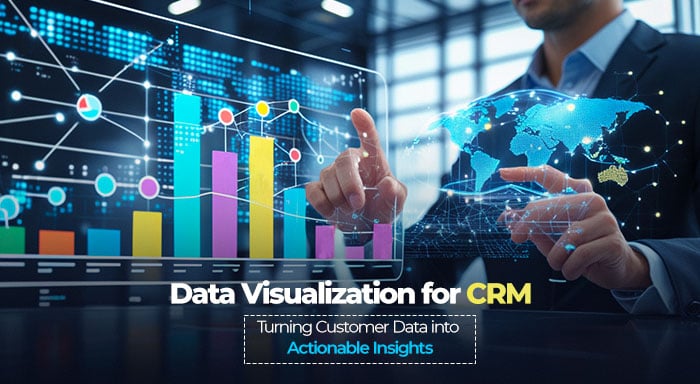
Incorporating fully-featured Customer Relationship Management (CRM) systems is imperative for the management of interactions, monitoring of leads, and most crucially, delivery of customer services in modern businesses. Yet, the information that is collated by a CRM tool is only as useful as the insights derived from it. This is where data visualization services come in to help – they take complex customer data and present it in easily understandable forms such as dashboards, graphs, and reports.
Through the use of CRM visualization, businesses are therefore in a position to make sense of trends, workflow, and strategy based on real-time data. Whether it is enhancing customer data visualization, improving reporting and visualization, or using CRM charts to monitor key performance indicators, then data visualization becomes useful.
In this write-up, let us explore the significance of data visualization and reporting in the Customer Relationship Management platform. Here, you will learn about various types of visualization techniques, the right platforms to explore, and how you can do visualization.
Significance of Visualizing Data in CRM
Data visualization is an important technique that converts raw CRM information into relevant visual representations that offer meaningful insights. Such insights showcase trends, patterns, and relationships that might not be visible through manual overview in complex datasets. Visualization is a powerful technique that ensures quick analysis and reveals subtle patterns and insights.
Through this technique, you can convert raw numbers into smart visuals. Organizations can quickly find out sales opportunities, operational inefficiencies, and customer behaviors. This not only expedites decision-making but also ensures data accessibility for both technical and non-technical team members. This solidifies understanding of customer data.
Why Data Visualization is Crucial for CRM Success
A CRM system is a single point of contact for customer information, including sales activities, customer interactions, and preferences. However, without the right visualization, many insights remain locked away in spreadsheets and databases.
Some of the benefits of having a strong CRM visualization are:
- Fast Decision Making – It is easier to grasp information from a graph than from tables and numbers.
- Higher Sales Outcomes – It is possible to create better workflows that result in increased sales performance by identifying the bottlenecks in the sales pipeline.
- Improved Customer Segmentation– Visual representations aid in recognizing natural groupings in the customer base depending on preferences, behavior, and demographics. This enables more personalized marketing campaigns and customized customer experiences that substantially enhance performance in engagement and conversion metrics.
- Better Forecasting – The use of historical data in the form of trends and patterns is very useful in helping businesses to predict the future.
- Increased Employee Productivity – This is because a well-organized dashboard does not involve the user having to perform calculations to derive some information.
For instance:
- The sales teams will be able to use the CRM charts to track the monthly revenue.
- The marketing teams can also leverage the marketing dashboard to assess the overall performance of the campaigns.
These insights empower organizations to influence the behavior of the customers and as a result, improve the overall performance of the business.
Types of Data Visualization Used in CRM
1. Dashboards for Real-Time Insights
A CRM dashboard is a single interface that aggregates multiple data points and enables users to monitor performance based on key metrics in real time. A good dashboard should:
- Be current
- Be interactive with options such as sorting and drilling down
- Be designed to meet the needs of various business departments (sales, marketing, support)
2. Heatmaps for Customer Behavior Analysis
Heatmaps represent data using colors to indicate density. This technique is useful for:
- Analyzing visitor activity on the website
- Identifying the most used features of the CRM software
- Customer and user engagement in emails and other digital content
3. Sales Funnel Charts
The sales funnel chart is very useful for businesses to see the progress of leads through the sales funnel. With the help of the funnel representation, companies can:
- Determine potential customers’ problems, i.e., the points at which they may drop out
- Improve the strategies for lead nurturing
- Provide better estimates of the revenue that can be generated
4. Geographic Maps for Customer Distribution
Location-based customer data visualization is very important for businesses that have global customers. CRM-integrated maps can:
- Reveal the customer distribution across various areas
- Assist in concentrating marketing efforts on specific locations based on customers’ behavior
- Help in planning for logistics and distribution
5. Cohort Analysis for Tracking Retention
Cohort analysis is the process of categorizing customers by common characteristics like recruitment date or purchase action. This will help to:
- Define long-term retention rates
- Evaluate the effectiveness of loyalty programs
- Refine customer segmentation strategies
Common Challenges in CRM Data Visualization and How to Overcome Them
Challenge #1: Data Overload
This means that decision-makers may be overwhelmed by data. To resolve this, organizations must focus on vital performance metrics and avoid concentrating on their non-essential parameters.
Challenge #2: Poor Data Quality
Wrong or outdated CRM data provides unnecessary complications in the form of wrong insights. Companies should execute consistent data cleaning processes to set up governance protocols to ascertain the accuracy and usefulness of customer data.
Challenge #3: Lack of User Adoption
Even the best CRM charts are of no use if the employees do not use them. Making sure that the dashboards are simple to navigate and rendering relevant training can greatly improve the adoption rate.
Challenge #4: Integration Challenges
Not all CRMs are well integrated with third-party visualization tools. In order to choose a reporting solution, businesses should consider compatibility.
Top Tools for CRM Data Visualization Used by Companies
Widely prominent companies nowadays are leveraging data visualization services from prominent tools to handle their customer relations, develop more effective sales funnel, and design more effective marketing campaigns. Let’s take a deeper look at some of the top-rated tools leveraged by companies for data visualizations. These tools help companies to interpret their customer data well and extract valuable insights for a competitive edge.
1. HubSpot: Improving Sales Outcomes with CRM Dashboards
The CRM platform of HubSpot has CRM customer data visualization which enables sales teams to analyze deals, pipelines, and forecast revenue. Through the use of CRM charts like the bar graph and the line graph, sales managers can easily see who the top performers are and where deals are likely to get stuck. This visual technique of approaching CRM strategies allows organizations to refine their sales processes and improve the rate of conversion.
2. Salesforce: Customer Insights Powered by AI
Einstein Analytics integrates data visualization and reporting with AI-powered analytics in Salesforce. It also entails predictive analytics and can empower businesses to predict the ways customers can interact with the brand. For instance, an e-commerce company can use Salesforce’s heatmaps and geographic data visualization to determine the regions with the highest number of purchases and, in turn, adjust their marketing strategies accordingly.
3. Zoho CRM: Real-Time Reporting for Effective Decision-Making
Zoho CRM has reporting and visualization tools that enable organizations to design their own dashboards that are updated in real-time. For instance, a customer support team can use Zoho’s dashboards to track:
- The time it takes to resolve tickets
- The customer satisfaction score
- The efficiency of the response
This ensures that the level of service remains high.
4. Google Data Studio: Integrating CRM Information with Marketing Analytics
Google Data Studio is a top-level platform that helps organizations integrate their CRM information with marketing performance information from Google Ads and Google Analytics. This integration is very useful for marketing teams as it helps them to:
- Visualize customer paths
- Optimize ad spend
- Track the performance of lead-generation campaigns
These visualization techniques can be implemented by businesses to gain more understanding, work more effectively, and make decisions based on data to support growth.
Final Thoughts
Leveraging reporting features and data visualization techniques is a powerful way for businesses to extract value from their customer data. With interactive dashboards, heatmaps, and CRM charts, teams can make data-informed decisions that:
- Increase customer interaction
- Increase sales
- Increase productivity
With the help of data visualization services, organizations can convert their CRM systems from basic data storage tools into powerful decision-making tools. Companies need to realize the significance of CRM visualization for real-time sales performance, analysis of customer behavior, or report automation in the present dynamic business environment
%201.png)

%201.png)

%201.png)